Purpose
The purpose of this page is to consolidate the various contributions that I have made in the process of working on this software engineering project and building Billboard, from code and documentation to team tasks and project management.
Overview
For CS2103T, a Software Engineering module, my team of 4 others and I were tasked with enhancing a pre-existing application called AddressBook 3. It was a desktop Address Book application of considerable size. Through the various cycles of ideation and development, we eventually settled on the idea for Billboard.
Billboard is a financial management application with emphasis on speed and simplicity. Among the unique traits of Billboard is that it is a desktop Command Line Interface (CLI) application, with most of its functionality accessed via typing commands into a console. Billboard supports all the basic operations that are needed to effective manage your finances. You can:
-
Add new expenses to the list
-
Edit past expenses
-
Delete past expenses
-
View your expenses so you are able to keep track of them
Additionally, Billboard sports several enhanced features that make it stand out. These features include tagging expenses, archiving past expenses, filtering the current list of expenses, and dynamically displaying statistics based on the current expense. All these features aim to ease the process of managing and organizing your finances.
Legend
The below styles of formatting are used to demarcate certain sections of text with special meaning:
| Additional information that the reader should take note of. |
text: Indicates that text should be treated as a command or code.
Summary of contributions
Preface
This section documents the various contributions I have made to Billboard, in the hopes that it will serve as a useful reference and proof of work in the future. These contributions include code, documentation, as well as project management.
-
Code contributed: [Functional code tracked by RepoSense][GitHub Repository for project]
-
Major Feature: Completely implemented statistics chart feature from the ground up
-
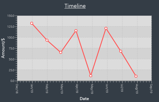
Details: Feature is a fully responsive statistic display feature. Statistics based on the currently shown expenses are displayed in a statistics panel. Any changes to the expenses will automatically trigger an update in the displayed statistics. In addition, various types of charts with various ways to add extra configuration are bundled with the feature.
-
Justification: This feature is a significant and noticeable enhancement to the user experience. One of the critical areas of managing finances is being able to keep track of and monitor your expenses over time. My statistics feature offers several different ways for users to do that. In addition, its dynamically updating capabilities means less keystrokes wasted for the user to configure the statistics to see what he wants, greatly improving speed of use.
-
Highlights:
-
This feature integrates well with, and even complements existing features. Combined with the tagging feature, it allows users to easily group expenses by tags to view, allowing for a high degree of organization. Combined with the finding functionality, it allows users to be able to effectively search for expenses they want, and instantly get an overview of relevant information.
-
An attempt was made to make the implementation as extensible as possible. For example, adding different types of charts and different options to configure the charts should not be a huge issue. However, certain other changes such as adding new types of financial records (ie. income) may pose some difficulty to adapt.
-
Credits: JavaFX Chart library, for providing robust, configurable charts GUI implementations.
-
-
Minor enhancements:
-
Updated Ui to a format that can integrate the statistics chart in an eye-pleasing manner.
-
Wrote reusable and generic classes and methods that team members incorporated into their code. [DateRange Enum]
-
-
Other contributions:
-
Project management:
-
Set up Git Repository with branch protection rules and configured CICD to work with new repository.
-
Set up project issue board on GitHub and created various labels to ease issue management and create a single source of truth for project development.
-
-
Enhancements to existing features:
-
Did initial adapting of
Personin AddressBook toExpensein Billboard. [PR #38] -
Extensively wrote tests to help maintain a code coverage of above 75%.
-
-
Documentation:
-
Community:
-
Tools:
-
Added third party libraries (HamCrest and Mockito) to the project to help to ease writing fluent and effective unit tests.
-
Updated Checkstyle rules to fit our teams requirements.
-
Contributions to the User Guide
Seen below are the sections that I personally contributed to the User Guide for Billboard. They showcase my ability to write precise and concise instructions for users that may be unfamiliar, and to explain the purpose and advantage of my feature, the dynamic statistics charts. |
Displaying of statistics: display-stats
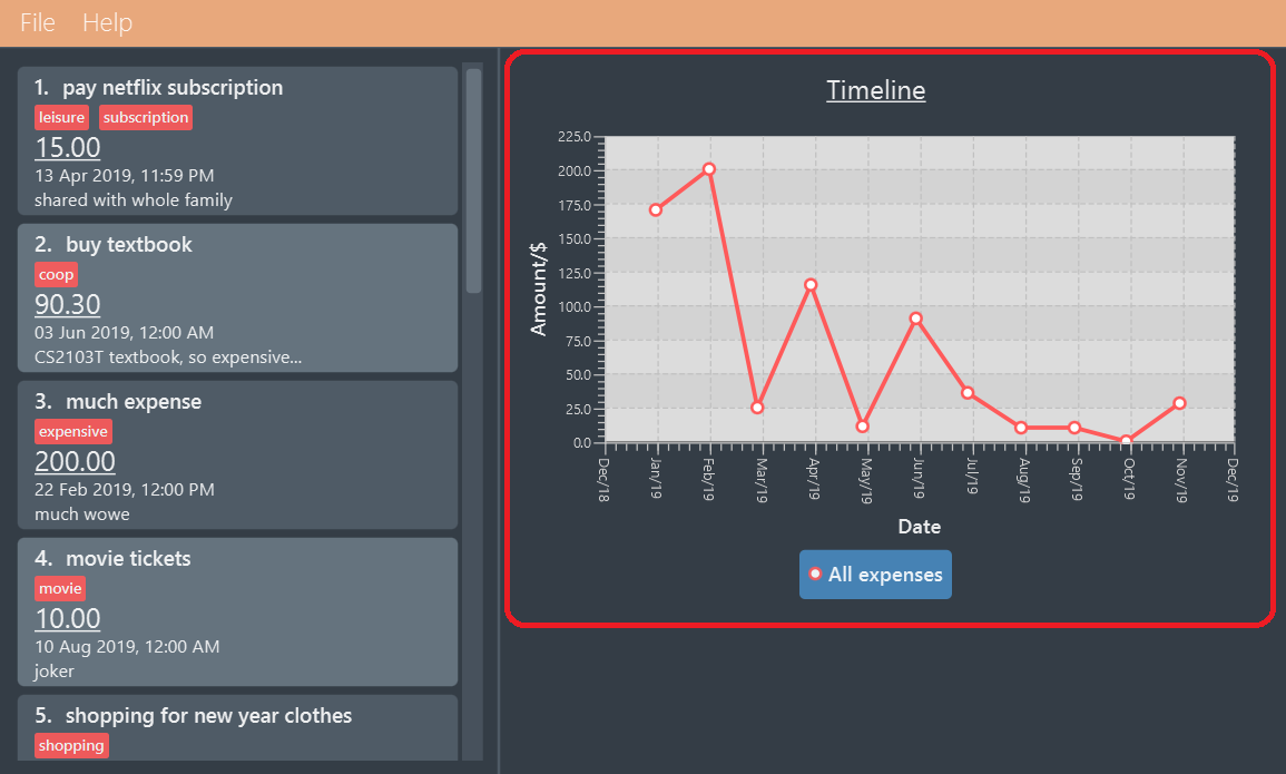
Billboard has a powerful statistics display system! While trying out other features, you may have realized that the highlighted chart changes from time to time.
That is because Billboard has a fully responsive statistics display with charts that dynamically update themselves. You can simply enter any command that changes the displayed
list of expenses, such as add n/automatic stats displays are cool a/50.00, and watch as the chart updates automatically.
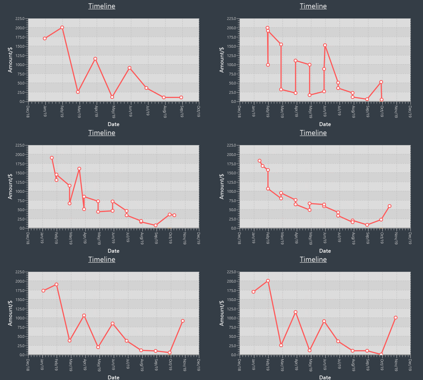
Should you want to view different types of statistics and customize the information you get, Billboard also supports various different types of charts, with a plethora of different customization options. Read the documentation on individual commands below to find out more.
| The options available are tailored to each specific chart type and thus, not all charts may support the same options. The individual sections for each command goes into further detail about the supported options for that command. |
With this, it becomes effortless for you to perform advanced queries on specific types of statistics! For example,
if you want to track the weekly total spending of all your expenses that contain the word "food" over a specific month, simply type display-stats timeline interval/week
followed by find d/food sd/01/01/2019 ed/01/02/2019. (Unsure about this command? Refer to [Find] for more information).
Display timeline overview of expenses: display-stats timeline
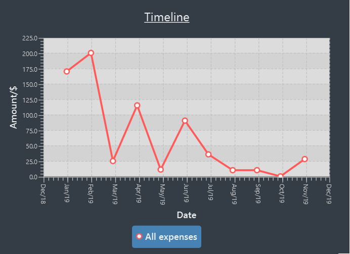
You can view one or more timelines that are based on your currently displayed expenses. Upon entering the command, the statistic chart will automatically update to display a timeline configured with the options you have provided.
The expenses over a specified time period are aggregated and added as data points on the timeline, allowing you to easily keep track of your relative spending. You can customize the date interval used, as well as the groupings used to split your expenses into each individual timeline.
Usage:
display-stats timeline interval/<DATE INTERVAL = MONTH> groupby/<GROUPING = NONE>
INFO:
-
DATE_INTERVAL: Specifies the date interval to be used to aggregate the expenses by. Supported date intervals include 'day', 'week', 'month' and 'year'. The start date of each interval will always be the "logical" start, ie. the start date for "week" will always be a Monday and the start date for "month" will always be the 1st of that month. -
GROUPING: Specifies the grouping to use to group the expenses into each separate timeline. Supported groupings include "none", "tag", "month" and "day-of-week".
Example:
display-stats timeline interval/month groupby/tag
Displays timelines based on the displayed expenses. First, the expenses are divided based on tag, forming one timeline for every tag. Next, for each timeline, the total amount spent each week, starting from Monday and ending on Sunday, is totalled to form each data point. The chart may look something like this:
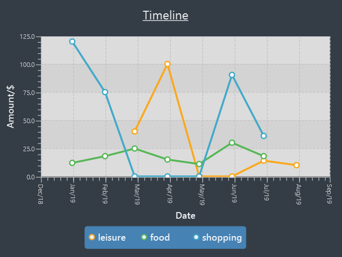
The options for this command, and for all other display-stats commands, are case-sensitive, ie. "Week" is not a valid substitute for "week".
|
Display breakdown of expenses: display-stats breakdown
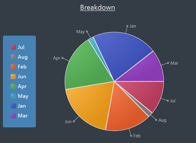
You can break the displayed expenses down into smaller groups and view that breakdown as a pie chart, allowing you to compare your spending between groups. Upon entering the command, the statistic chart will automatically update to display a breakdown chart configured with the options you have provided. The total
expenses per category are totalled and displayed as each slice in the pie chart. You can customize the criteria used to split the expenses into groups.
Usage:
display-stats breakdown groupby/<GROUPING = TAG>
INFO:
-
GROUPING: Specifies the grouping to use to group the expenses into each separate slice in the pie chart. Supported groupings include "none", "tag", "month" and "day-of-week". Note that the default value forGROUPINGfor this command is not "none", but "tag". (The "none" option has limited use).
Example:
display-stats breakdown groupby/MONTH
Shows a pie chart breakdown by month of all currently displayed expenses. Within each grouping, the total expenses in that grouping are summed up, and the
total amount determines the size of its slice of the pie chart.
Display heatmap of expenses: display-stats heatmap
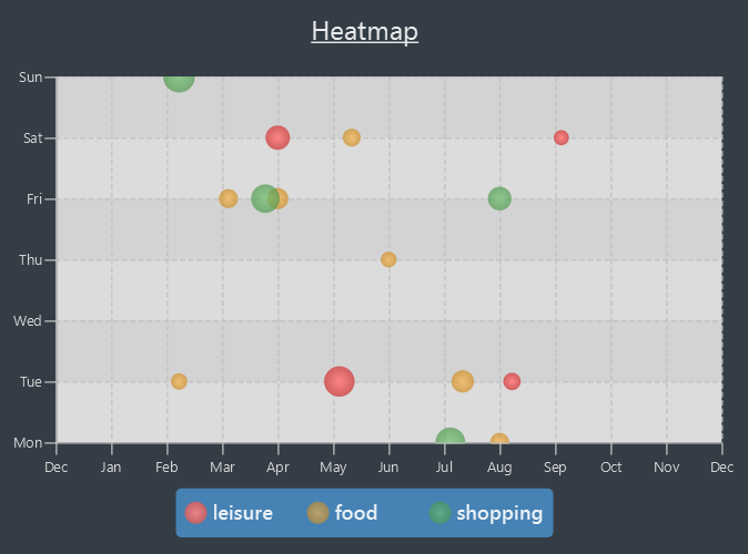
You can view a heatmap of total expenses per day for the currently displayed expenses, limited to the past year. The y-axis represents the day of the week the expense was made, while
the x-axis represents the week of the year the expense was made, with each bubble representing the expenses made on that particular day. The larger the bubble for the particular day, the higher the total expenses on that day.
This allows you to get an overall impression of your spending behaviours over the past year.
Usage:
display-stats heatmap groupby/<GROUPING = NONE>
INFO:
-
GROUPING: Specifies the grouping to use to calculate the heatmap. Expenses from different groups that occur on the same day will not be totalled, and will instead form two separate bubbles of different colors. Accepted values include: "none", "tag", "month", "day-of-week'.
Example:
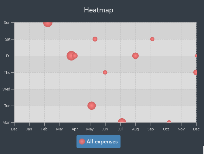
display-stats heatmap groupby/none
Shows a heatmap of all currently displayed expenses, limited to a year. Since "none" grouping was specified, the expenses are not grouped and are all categorized under "All Expenses".
The displayed chart may look something like this:
Contributions to the Developer Guide
Displayed below are the sections I contributed for the developer guide. They highlight the work done into building a clean extensible architecture for statistics display, and my technical writing capabilities in conveying fairly technically heavy concepts in relatively simple prose. |
Statistics
Billboard includes a dynamically updating statistics panel containing a chart. It has the following functionality:
-
Every time the displayed list of expenses changes, the chart automatically updates with the new changes
-
Users can submit commands to change the displayed chart as well as change configuration options for the charts
This functionality is made possible through the statistics module. The statistics module is in charge of generating statistics from the currently displayed expenses and rendering it onto the main window. There are 2 components that help to do this - the chart component and the statistics generator component.
Chart component
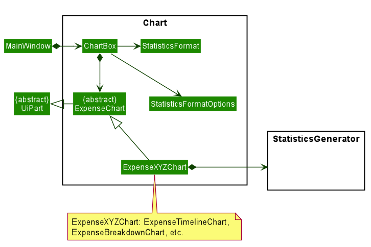
There is a special Chart component that deals with the generation and rendering of specific charts based on user input and the expenses being displayed.
The ChartBox is the main orchestrating class. It is updated with the latest StatisticsFormat and StatisticsFormatOptions that the user selects, via the MainWindow.
These are classes that represent user configuration on what to be displayed. Upon being updated, it creates the appropriate
ExpenseChart with the selected options, to display the selected statistic based on the currently displayed expenses. To transform the data from
the displayed list of expenses to the statistic format required, the StatisticsGenerator component is used. The concrete ExpenseChart obtains the formatted statistics from the
StatisticsGenerator component.
Statistics Generation Component
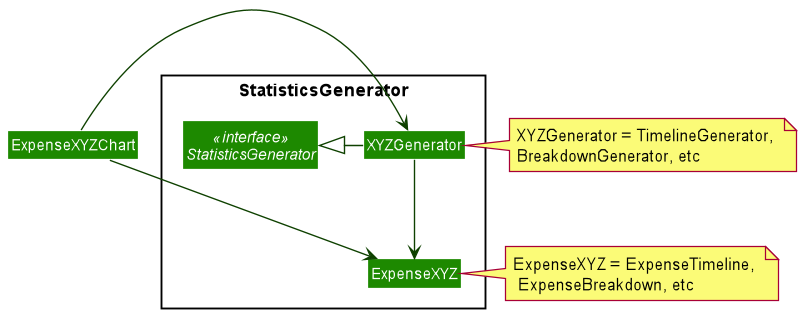
The concrete ExpenseChart obtains the data to be displayed from the StatisticsGenerator component. A number of classes,
such as BreakdownGenerator and TimelineGenerator extend StatisticsGenerator, and each is in charge of creating a specific
statistic type, ie. ExpenseBreakdown and ExpenseTimeline. These concrete statistic types encapsulate all the information relevant
to the statistic, which the concrete ExpenseChart then uses to render the statistic display.
Proposed Implementation
The chart feature can be roughly split two separate parts:
-
The dynamic rendering of the chart whenever the displayed expenses are updated
-
The functionality to switch between different statistic types and configure customization options
| The Observer pattern plays an integral role in the implementation of major part of the system. To summarize, it is a design pattern that achieves decoupling by having observers "subscribe" to changes in an observed object, and being notified upon any changes through callbacks. This is opposed to the observed class directly updating its observers. In the following, the term "notify observers" will be used to denote the act of an observed class being updated and updating all its observers, and the term "on update" will be used to denote the act of an observer receiving updates from its observed class. |
Below is a high level overview of the behaviour of the system when any command is called.
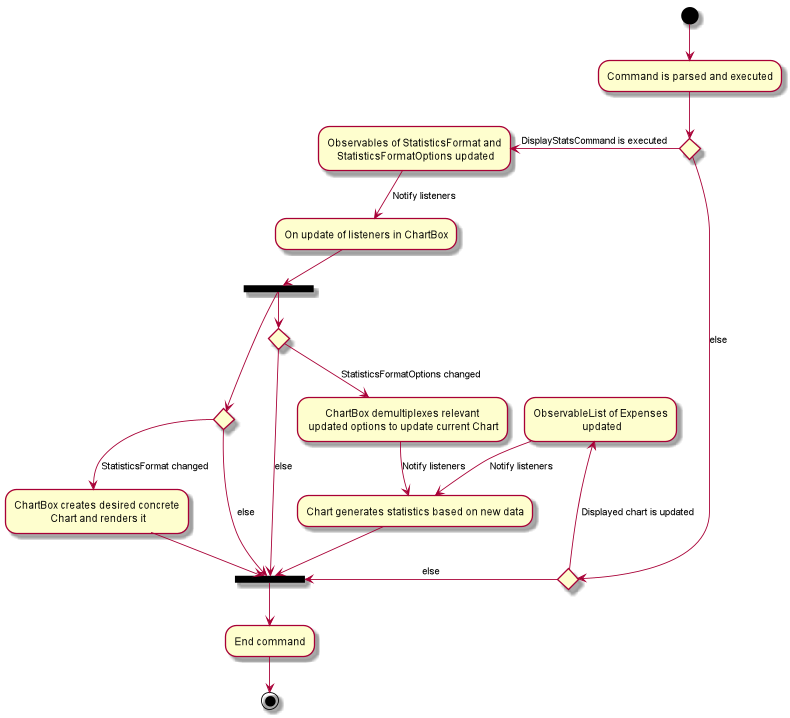
As you can see the logic follows the two paths outlined above. One path where the displayed expenses are updated, and one path where DisplayStatsCommand is executed, updating the chart.
Both paths can lead to the chart updating, followed by the end of the command. Each path will be explored in slightly further detail below.
Update to displayed expenses
-
The current
ExpenseChartobserves the list of expenses that are contained in theMainWindow. -
When a command which updates the expenses is executed, that command updates the list of expenses in the model.
-
That update propagates to the list of expenses in
MainWindow, which notifies the current chart of its changes. -
Using a
StatisticsGenerator, theExpenseChartthen generates the statistics to be displayed from the new expenses. -
In this manner, changes to the list of expenses are propagated to the display.
An example of how this works can be seen in the sequence diagram below, in the example where the user changes the displayed expenses by using the ListCommand.

DisplayStatsCommand is called
-
The orchestrating
ChartBoxobservesStatisticsFormatandStatisticsFormatOptionsin the model. -
When
DisplayStatsCommandis called, it updates those two objects in the model sequentially. -
First,
ChartBoxis notified aboutStatisticsFormat, and if there is a new one, it creates the appropriate chart and renders it. -
Next, if there are changes to
StatisticsFormatOptions, theChartBoxpropagates the relevant changes to the current displayed chart, to update its display. -
In this manner, the current chart can be updated with the new
StatisticsFormatandStatisticsFormatOptions.
An example of how this works can be seen in the sequence diagram below, where DisplayStatsCommand is called with a new StatisticsFormat.
StatisticsFormatOptions is omitted for simplicity.

Design Considerations
Aspect: Approach to generating of statistics
-
Alternative one (current choice): Each time there is a change in the backing list of expenses, the statistics are re-generated by the specific
StatisticsGeneratorfor the appropriate statistics format.-
Pros:
-
Simplest implementation, each statistic generator can simply provide a pure function with no side effects that maps from a list of expenses to the desired format of statistics.
-
Runtime is acceptable as most operations can run in O(n) time at worst, with a reasonable input size of expenses.
-
Statelessness means it is thread safe.
-
-
Cons:
-
Even in cases where the backing list of expenses only change by one element (eg. when a single expense is deleted), the entire set of statistics will still be re-generated from the list, thus potentially incurring an expensive operation each time the list is changed.
-
-
-
Alternative two: Each
StatisticsGeneratorcan be structured as a data structure that keeps track of the current statistics data. Upon a change in the backing list, only the specific change will be propagated, ie. addition of one new expense will internally callStatisticsGenerator#AddExpensewhich modifies the statistics data appropriately.-
Pros:
-
For simple list changes like adding/removing a single expense, this approach is much faster as it does not have to regenerate the statistics from the entire list, the statistics only needs to be updated with the specific change.
-
-
Cons:
-
Complicated, need to include methods to handle cases where expenses are added, removed and updated, for every statistic type. If the entire list is changed frequently, there is no performance benefit.
-
Worse in terms of testability. The
StatisticsGeneratorwill depend on an internal state which can be complicated for certain statistics. -
Not thread safe, in the case of future upgrades to a multi-threaded application, will require adjustments.
-
-
-
Alternative three: The data for certain aggregate statistics formats can be serialized. These formats include things like lifetime average spending per day/week/month, total number of expenses etc. Upon addition/removal/update of expenses, an in-mem copy of the serialized data can be updated and saved.
-
Pros:
-
The data for certain statistics formats will always be quickly available by simply querying the storage.
-
The data can be stored in a human readable format, so users can view those statistics without opening the application.
-
-
Cons:
-
Requires extra complexity to serialize the data upon each change to the overall list of expenses.
-
-